3 Storytelling Mistakes That Hurt Your UX Career
The less you do these, the more people will understand and appreciate your work.
Harsh Truth
The harsh truth about UX is that your work is only one part of the equation. How you communicate it to others is just as important.
Communication
Communication comes with a variety of challenges that most designers aren’t prepared to tackle. Study these mistakes, and you’ll be better prepared than most…
Mistake 1: Focusing on Process
Designers often describe the process of how they created the design. Most of the time, your audience just wants to focus on outcomes, not process.
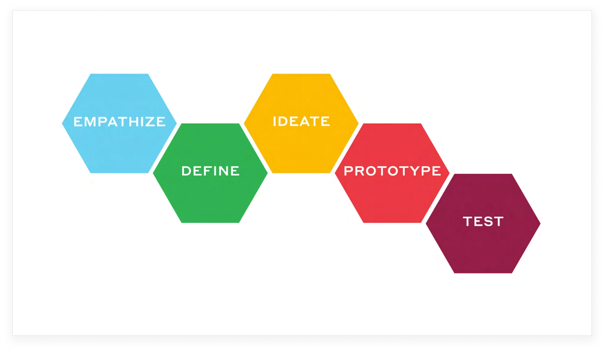
 Designers commonly dedicate time at the beginning of their case studies or design presentations to high level processes like design thinking. This hides what's really important—the problem, the actual work, and the impact.
What To Do Instead
Talk about how your design will deliver desired outcomes. Keep the focus on what the audience wants, not what you’ve done behind the scenes.
Mistake 2: Describing the UI
User interface is about the “what.” It’s a simple description of the design. User experience is about the “why.” Again, your audience is focused on outcomes.

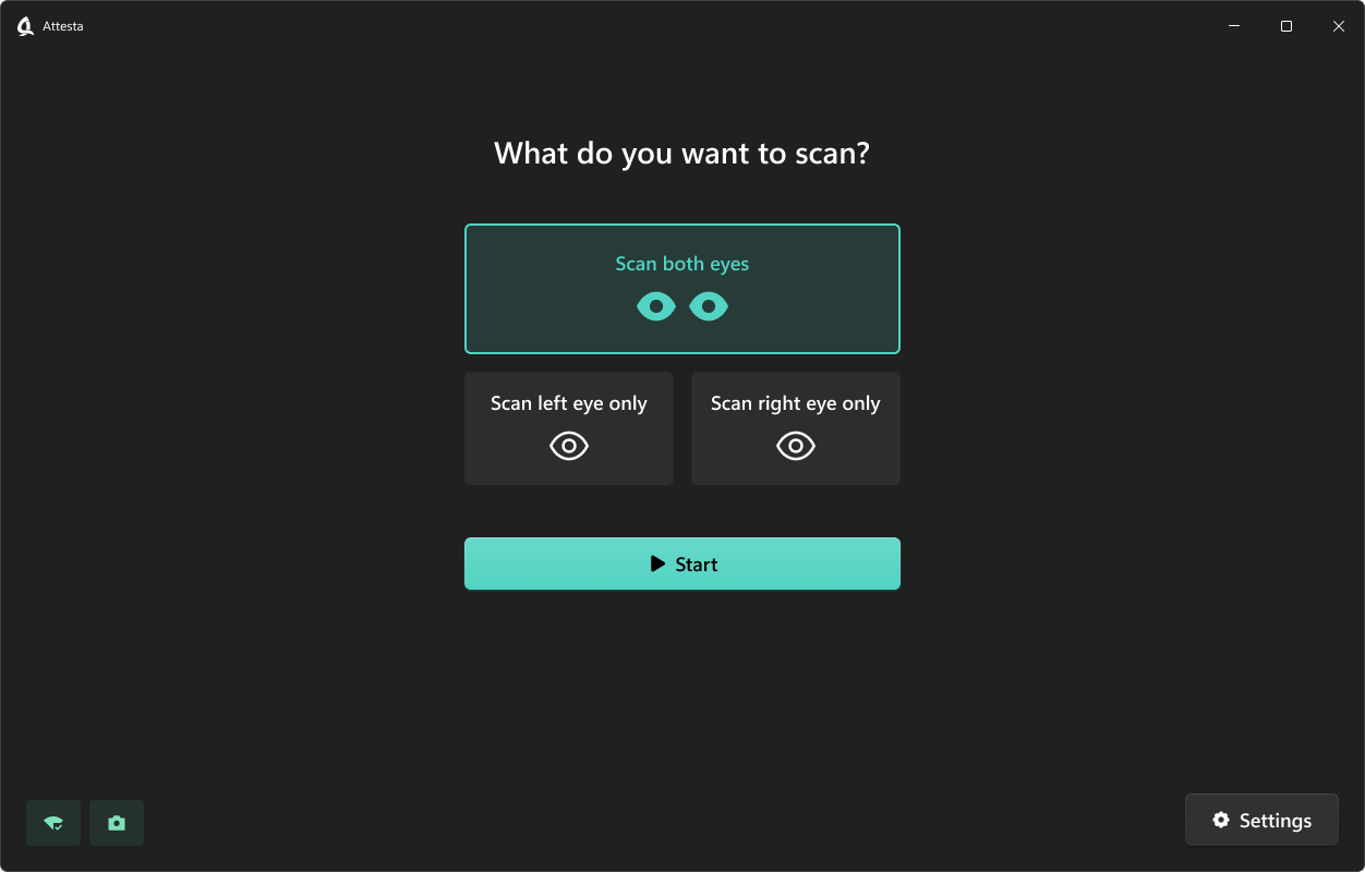
This is a screen my agency designed for a client. The designer could present this to the client and simply describe what's there. Like this:
"There are 3 options at the top. Scan both eyes, Scan left eye only, or Scan right eye only. The selected option is highlighted with a teal border. The large Start button below initiates the scan once the user has made their selection"
What To Do Instead
Explain why your design will lead to positive outcomes. Frame everything in the context of results. Don’t just describe the UI. Like this:
"The old design has been completely overhauled to prevent the usability mistakes we're seeing in the field and make eye scans faster. The most common action, Scan both eyes, is selected by default which will be twice as fast as the old design. There's also plenty of space between the scan options and the start button now, which will minimize the biggest complaint we have from operators: Accidentally tapping a scan option instead of the start button."
That shift in communication makes for much more effective design presentations—and separates senior designers from their more junior colleagues.
Mistake 3: Using Generic Language
Designers sometimes describe things in ways that don’t inspire. Example: “This design is in line with current industry standards.”
What To Do Instead
Describe things in a way that creates emotion. Example: “This design will make it twice as easy for users to reach the next step, which will significantly increase conversions.”
Review
- Focusing on process
- Describing the UI
- Using generic language
Avoid those common mistakes, and you’ll see more success.

